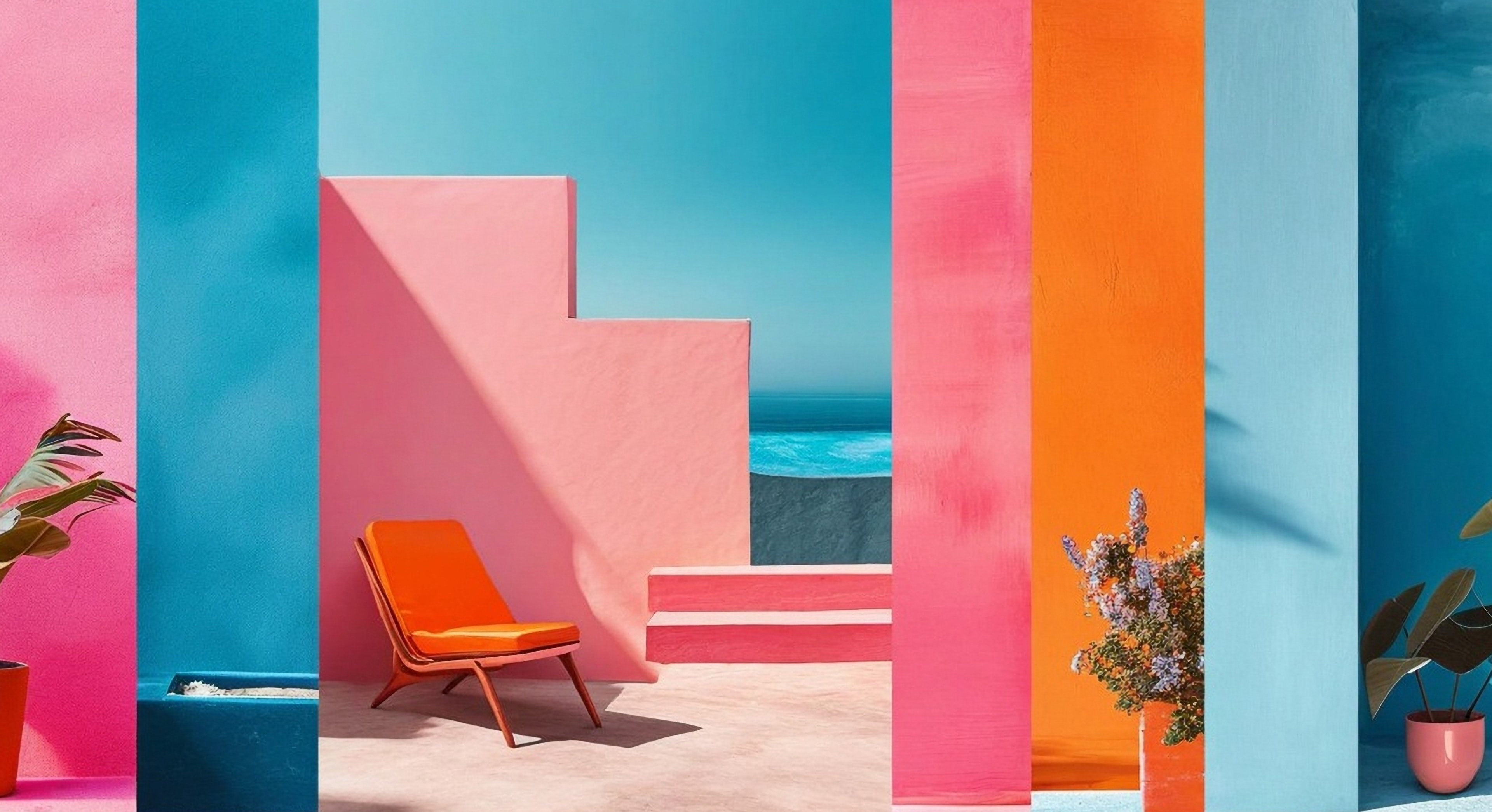


Remember when every brand wanted to be the next Apple, all sleek minimalism and grayscale? Yeah, those days are gone. Brands are embracing colour in a big way, using it to tell stories, evoke emotions, and carve out their own unique space in the market.
Forget everything you thought you knew about "millennial pink" and "Gen Z yellow." We're diving deep into the psychology of colour – where science meets art and gut feelings reign supreme. This ain't just about what looks pretty; it's about understanding how colour influences our emotions, perceptions, and yes, even our wallets. We're talking about the psychology of colour, the gut feelings, the vibes, the je ne sais quoi that makes a brand pop like a firework on New Year's Eve.
Social media is a riot of colour
Remember when social media was a sea of bland blues and corporate grays? Yeah, me neither. These days, it's a full-blown sensory explosion, and colour is leading the charge. We're seeing a surge in vibrant, saturated hues that jump off the screen and grab your attention by the eyeballs. Think electric blues, fiery oranges, and shocking pinks – colours that scream "look at me!" in a world of endless scrolling.
Why? Well, with attention spans shorter than a goldfish, brands are realizing they need to hit us with a visual sledgehammer. And what better way to do that than with a jolt of pure, unadulterated colour? Let's face it, our social feeds are a kaleidoscope these days. But amidst the chaos, some trends are emerging. Bold, saturated hues are having a moment. Think vibrant magentas, electric blues, and zesty oranges – colours that cut through the noise.
Branding: It's not just black and white anymore
Remember when every brand wanted to be the next Apple, all sleek minimalism and grayscale? Yeah, those days are gone. Brands are embracing colour in a big way, using it to tell stories, evoke emotions, and carve out their own unique space in the market.
We're seeing a resurgence of vintage-inspired colour palettes, with muted tones and earthy hues giving brands a sense of authenticity and nostalgia. Think faded denim, dusty rose, and sun-baked terracotta. This trend taps into our collective yearning for simpler times, for brands that feel "real" and down-to-earth.
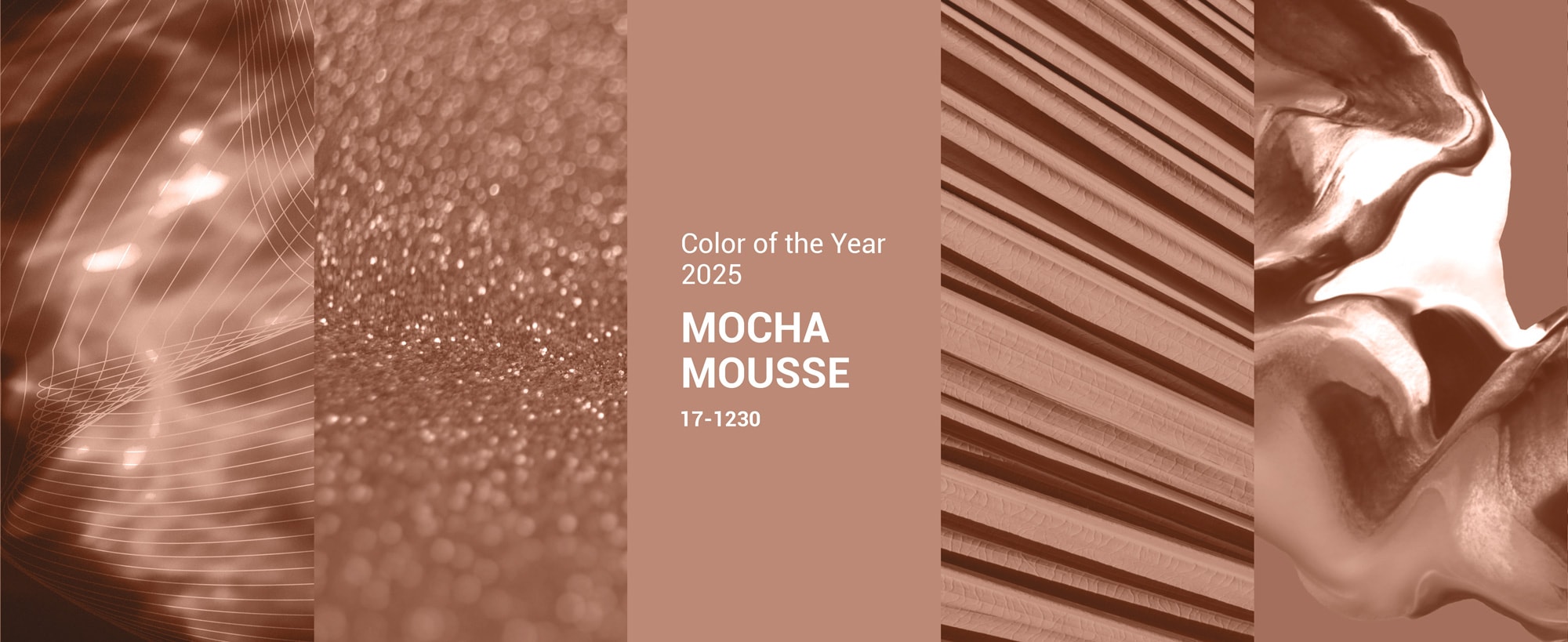
In line with colour psychology, the 2025 PANTONE Color of the Year (17-1230 Mocha Mousse), with its sophisticated, earthy elegance, enhances a wide range of palettes and applications, from minimalist to richly detailed designs, across all colour-focused industries.
Color by Sector: It’s not a one-size fits all
Of course, colour trends vary across different industries. In the tech world, cool blues and greens still reign supreme, conveying a sense of innovation and trust. But even here, we're seeing a shift towards bolder accents and playful gradients, reflecting the increasing humanization of technology. The colour wheel offers a range of choices for designers and brand artists to pick and choose what works best for the discerning eye - a colour palette that appeals to your audience.
Why does all this matter?
Simply put, colour is a powerful visual stimulant. It can evoke emotions, influence perceptions, and drive behavior. As creative professionals, we need to be on top of the latest colour trends, not just because they look cool/good/pretty, but because they speak to the deeper psychological and cultural currents shaping our world. That’s why we run A/B testing to find out which colour delivers the best results in CTA buttons. We make sure we do our research and hold focus groups to get input and relevant feedback on how our target user perceives a new brand - like or no like?
At the end of the day, we are humans interacting with brands and experiences - be it a banner, website, window shop or flyer. As much as we would like to think of colour as an aesthetic element of design, it is very much a psychology based on science.
So, keep your eyes peeled and your colour palettes fresh. Don't be afraid to experiment, to push boundaries, and to use colour in unexpected ways in your brand guidelines. After all, in the words of the great Picasso, "colours, like features, follow the changes of the emotions."
About the Author
Molly Almasri is an accomplished visual storyteller with over 27 years of experience, specialising in the strategic fusion of visuals and words. She excels at crafting compelling brand experiences across strategy, branding, design, video production, and digital content. Her career spans both agency and in-house roles, providing a unique and insightful perspective on effective brand communication. Molly joined Birdie & Partners as Creative Director - Design and has since been creating impactful narratives and designs that resonate deeply with audiences.
Connect with Molly Almasri on LinkedIn.
Want the experts at Birdie & Partners to help your brand grow? Click here to leave a message.
#ColorPsychology #DesignTrends2025 #CreativeDirection #VisualStorytelling #ColourStrategy #BrandIdentityDesign #ColorTrends2025 #Pantone2025 #VisualTrends #DesignLeadership #MarketingDesign